Trade shows are undoubtedly one of the most significant events for brands to generate awareness and leads, and increase sales. You want to reap the best results from trade shows for your organization. The sole purpose of trade shows is the exhibition & showcase of companies’ newest products or services. As such, it’s an excellent place for people to network with professionals in the same industry.
Exhibiting at a tradeshow may require a considerable investment of time, money, and resources, which is why it’s important for you to maximize the potential return on your investment.
To make sure you have started on the right foot, do not neglect the importance of the trade show booth graphics of your brand. Failing to invest in well-designed graphics and signage can have a damaging impact on your brand image.
Few Common Mistakes While Designing Trade Show Graphics
- Creating A Complicated Message
- Trying to Incorporate too Much Information
- Using an Outmoded Booth
- Failing to Highlight the Benefits
- Relying on Low-Quality Graphics
- Selecting the Wrong Size Of Exhibit Space
- Not Taking Lighting Seriously
We are here to help you explore some trade show graphic design mistakes to avoid.
Mistake 1: Creating A Complicated Message

When it comes to creating an engaging message, simplicity is the key. It goes for both the design of your booth and the message that you want to convey to your potential customers. A lot of businesses have great products and services but still, they fail to sell them because of their lengthy and complicated messages that are hard to understand for the super-busy audience. If your message takes more than three minutes to read, it means the message is lengthy and complicated.
Mistake 2: Trying to Incorporate too Much Information

Most businesses prefer to choose a message that comes with a lot of information and that’s many exhibitor design displays have a high volume of visual content. Although you may feel the urge to cram your texts and imagery into every bit of space, keeping it simple is the key to creating a compelling design. The majority of successful trade show display graphics design leverage the power of whitespace to highlight their hedging, texts, and images to incorporate important information, therefore, space is the one important element that you should know how to use properly.
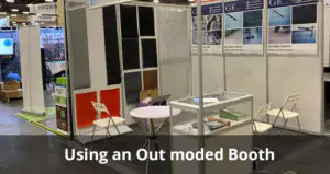
Mistake 3: Using an Outmoded Booth

Is the age of your display very apparent? Are there too many visible signs of wear and tear that are no longer easy to camouflage? If the answer to the above is yes, it’s probably the right time to invest in new exhibition hardware. Whether you are buying a small and portable booth or a large trade show exhibit, having a sleek, clean, and the modern display is an effective way to engage and impress your audience. ARC offers best-in-class graphics design Services for your trade show exhibit – at the most competitive price.
Mistake 4: Failing to Highlight the Benefits

When someone visits your booth, you only have a few seconds to engage their attention and present what your product or service can do for them. You have limited space to communicate the benefits, so it’s important to highlight them wisely. Every element of your design should talk about how your product or service can solve your customers’ problems. For example, if you are selling shoes, you would obviously emphasize the quality, comfort, and visual of the shoes.
Mistake 5: Relying on Low-Quality Graphics

You cannot attract the attention of visitors and encourage them to visit your booth with inexpensive, blurred, low-resolution graphics. Your visuals should always be engaging, as this enables you to create a lasting and compelling impression in the minds of your visitors – How do you do this? With three vitally important and engaging elements: Vibrant Colors, Striking Images, and Superior Print Quality!
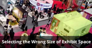
Mistake 6: Selecting the Wrong Size Of Exhibit Space

A lot of businesses rent a booth that is too large for their actual needs, resulting in a poor return on investment, as a result of the booth being disproportionate and intimidating – attracting a lower-than-expected footfall (footfall?). Many businesses find a smaller space more appropriate and a great deal more intimate; resulting in their booths attracting more visitors into an altogether more comfortable environment.
Mistake 7: Not Taking Lighting Seriously

Lighting is one of the most important aspects of an exhibition booth design; however, many exhibitors insist on not taking it seriously. A small change in your booth lighting can have a serious impact on its appearance. You can create a high-end look and generate a positive impression with your backlighting.
If you want to make your booth more inviting for those all-important visitors, create a warm and relaxing atmosphere with adjustable ambient lighting. If visitors to your booth feel warm and relaxed, they are more likely to spend more time in your booth, enabling you to engage more effectively with them – resulting in a more significant opportunity to discuss and sell your products and services.
So, we trust we have enabled you to understand the importance of stunning retail display graphics for your trade show exhibit and how they can leave an immediate and indelible impression upon your visitors – ARC is your one-stop solution for creating great exhibit prints and stunning booth graphics!